2 Versions, but I'm pretty sure I like the top one better. I did the second one first. 2nd department. I didn't have much type to work with because this French photo/design team had a site written in French. Also, I didn't want to disturb the bigger photos..
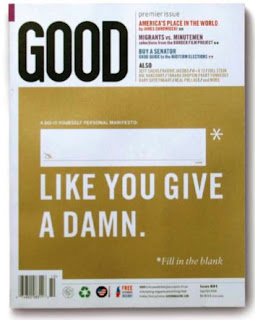
I love GOOD magazine! It would be amazing to work here! I love that all their proceeds go to non-profit organizations, their creative infographics, honest articles, and that the magazine is dedicated to doing good. I don't know how realistic this is, but I think it would be amazing to work for Sagmeister. He's crazy famous, but I love the ideas and messages in his work. His aesthetic is unlike usual graphic design, it borders fine arts and it always looks original.
I decided to redo my infographic. Staying with the same format, I just changed the graphics because I got tired of the old one...it just started to look really ugly to me for some reason. I think this one is easier to understand too...
I completely changed my poster with the quote. The type is similar, but I realized that this format would be better for my book. Also, I just wasn't into the other one...it felt too delicate and decorative...who can take that seriously? I think this one is more powerful and up-front.
I think I'm finished...I've been going back to this one so much that it all starts to just look the same...I like it now though...the perspective is kinda weird, but it's supposed to be off...
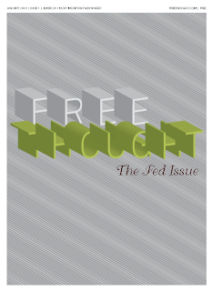
Like the Fed, it appears to be beneficially necessary to our country, but if you look deeper, there's a lot of faults and corruption, and it only benefits those who are in great power.
I fixed the perspective by making the most recent years(the ones closer in the front) to be bigger than the older years(the ones in the back.) So when you look at it, the newer(2008) is bigger and appears to be closer to the front.