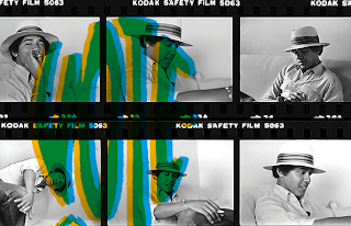


 This mini book is to go along with my VOTE poster. Changed a lot of the layout and some images. Trying to make something out of nothing is not easy, but I'm trying with this...


 So I made a Vote poster a while ago and I really want to include it in my portfolio. I also put them up all around Brooklyn and took pics of them. I'm working on this mini book that shows those pics and some other things that would persuade people to vote. I'm designing this as if it's before the elections.
 I've been working on this poster about a design manifesto to steer away from designing things that just perpetuate consumerism, instead to design things that benefit the world and each other, which i call "conscious design." Since there was a lot of type that needs to be easily read, I wanted to put the focus on that body of text. Also, I wanted to create some sort of world/city to give the idea of awareness of the world or surrounding. I'm still pushing this idea...I definitely want to elaborate on my "city/world."


 Changed some things on the department spreads. I changed the type and the stories. I'm not sure about the type...I like it, but I don't know if it reads the way I want it to read...maybe I've been looking at it too long. It should read the bigger type first and then the gray, but it should be easy and right now I don't know if it is..


 Logo design for the magazine name. The last pic shows how the logo would be seen front and back (that's not the cover tho.) So it would be see in the front and back and it comes together on the spine where you can see the U. I'm open for suggestions on this... I'm not completely set on this design...maybe...I'm not sure...